December 16, 2015, 1:06 am
![]()
Agency:
DDVBProject Type: Produced, Commercial Work
Client: Ochakovo
Location: Moscow
Packaging Contents: Mead\ low-alcohol beverage
Background:
The basic principle of "Ochakovo" is a production according with traditional technologies. All drinks in the wide range of the company are made on classic recipes and from natural ingredients.
The mead from "Ochakovo" has become the main thing to be proud of - a drink has a great history and deep national roots. Due to the presence of natural floral honey in the recipe, "Ochakovo" mead has a fragrant aroma, rich and very mild flavor. In the hot season it's great thirst quencher and in winter – it warms. Nowadays, mead is gaining popularity - the drink is perfect for fun and hearty communications with friends and it may become an addition to celebratory dinner.
"Ochakovo" appealed to the specialists of the DDVB agency with the intention to "rejuvenate" the audience and maximize brand "check out" from the vast majority of competitors which are actively exploring the popular category and using the "traditional" and "Old Russian" visual images.
Challenge:
To develop a new brand of mead, that stands out from the competitors on the shelf and is able to attract young audience attention with its modern look, becoming thus more tasty and healthy alternative to usual low-alcoholic drinks like beer and various cocktails.
Solution:
In solving this problem the project team took a fresh look at the mead as tasty, but very "conservative" drink. As a result, the trademark received not only a new name - Medovukha "M", but also a quite unusual design concept, confirming the idea that traditional does not mean archaic.
The "Ochakovo" mead is a drink with sweet honey aftertaste, it creates a relaxed atmosphere for communication. For this reason, the visual image of the brand got an open, positive, but at the same time soft and unobtrusive character.
Warm colors and light, petal-lace-like flower pattern, enclosed in a honeycomb shape, symbolically reveal rich taste and aroma of mead. And together with the letter "M", released on a light background with the original shape, and the elegant bottle with a minimalistic design, the brand looks much more modern then the majority of its "tawdry" competitors.
The products under the new brand will appear in the retail chains of Moscow region and other big cities of Russia in the near future.
Read more![]()
↧
↧
December 16, 2015, 10:35 pm
![]()
Agency: Dentsu-Dojo
Chief Creative Officer: Joey Ong
Project Type: Produced, Commercial Work
Client:
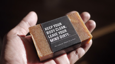
Cultured CavemanLocation: Philippines
Packaging Contents: All-natural Hand made Soap
Packaging Materials: Recycled Paper
We wanted to create a soap product that we can market specifically for the modern man and the naughty woman. The type you wouldn't be shy to display in your man cave. Forget about your Irish Spring and have The Man Soap in your bath to add some mood to that special showering moment. This All-natural Hand Made soap uses Coconut Oil and Palm Oil as base with added natural scents from Floral, to Fruity and Spice. It comes in 12 scents and is guaranteed to set the mood for any modern gentleman...Cultured Caveman.
Read more![]()
↧
December 16, 2015, 10:36 pm
![]()
Designer:
Alexandra GellerProject Type: Student Project
School: University of Wisconsin-Stout
Course: Product and Packaging Design
Tutor: Nagesh Shinde
Location: Menomonie, USA
Packaging Contents: Monopod
Packaging Materials: Paper
The US-ie was created to re-image the selfie stick and make the packaging re-usable as a carrier. When users take a “selfie” it refers to taking a photo of just themselves. The US-ie refers to a community term that means to take a photo of “us”. We encourage our users to explore and take photos with a group of friends, family, landmarks, and any awesome adventure they encounter.
What's Unique?
This packaging creates a new way of looking at a selfie-stick and reminds buyers that there is a world of things to record that aren't themselves. Some are packaged with specific cities, like Chicago and Minneapolis, and come with a map on where they can take a "us-ie".
Read more![]()
↧
December 16, 2015, 10:38 pm
![]()
Designer:
Alexandra GellerProject Type: Student Project
School: University of Wisconsin-Stout
Course: Product and Packaging Design
Tutor: Nagesh Shinde
Location: Menomonie, USA
Packaging Contents: Seeds
Packaging Materials: Paper, glass and mesh
In the past 20 years the population of monarch butterflies have declined by 90 percent. Part of this problem is the lack of milkweed being grown in the Midwest due to farmers cultivating land for agricultural use. Monarchs cannot survive without milkweed since the caterpillars only eat milkweed and the monarchs need it to lay their eggs on.
Mission Monarch is a seed packaging campaign for families and communities. The goal is to influence individuals to grow milkweed in their own yard to create a "monarch way station". Included are milkweed balls, seed trackers, an instruction booklet that turns into a poster and a packet with mesh and a rubber band. The jar itself can be used to take care of caterpillars when your milkweed eventually grows.
Read more![]()
↧
December 16, 2015, 10:44 pm
![]()
Agency:
by north™Project Type: Produced, Commercial Work
Client:
Arktis GelatoLocation: Bodø, Norway
Packaging Contents: Gelato, Sorbet, Soft serve
Packaging Materials: Plastic, paper
Arktis is a artisan gelato company situated in beautiful Svolvær, in the heart of the Lofoten Islands. Arktis produce natural gelato and sorbet with only natural ingredients. The production is done by hand and all the flavours are blended in manually. We wanted to capture the lines and the motion of the ingredients to give the public an association of the product on everything from the stationary to the website. It was a important for us to distance the identity and the products from other competitiors on the norwegian market.
Read more![]()
↧
↧
December 16, 2015, 10:45 pm
![]()
Agency:
by north™Project Type: Produced, Commercial Work
Client:
BådinLocation: Bodø, Norway
Packaging Contents: Beer
Packaging Materials: Glass, paper
Bådin Brewery just released a series of dark beers; a brown ale, a stout and a black IPA. Every beer has an unique history attached to it's name, so we wanted to present the beers along with things associated from that era/place/history.
Read more![]()
↧
December 16, 2015, 10:52 pm
![]()
Agency:
2YOLKFounding Creative Partner: George Karayiannis
Founding Managing Partner: Emmanouela Bitsaxaki
Graphic Designer: Sofia Pliakopanou
Studio Manager: Alexandra Papaloudi
Photographer: Stelios Tzetzias
Food Styling: Michael Athanasiou
Copywriter: Despina Sakellaridi
Account Manager: Olympia Aivazi
Project Type: Produced, Commercial Work
Client: Unilever
Location: Athens, Greece
Packaging Contents: Tomato Sauce
For 3 decades, Pummaro has been the leading brand in the tomato product category in Greece in terms of awareness and usage. Though it continues to enjoy the highest level of loyalty compared to its competitors (PL products and other well-established local brands), UNILEVER Hellas felt that the brand had been commoditized and was failing to adequately differentiate itself from competition. Research carried towards the end of 2014, made it apparent that while Pummaro continued to enjoy all the love of a major brand, its older consumers felt that the brand “has been resting on its laurels” and "not really giving a solid reason-why for price premiumness".
The challenge set for 2yolk branding was to create a striking rebrand and packaging for a range of 17 Pummaro products that better communicated the unrivaled taste and quality of the product along with the caring and generous character of the brand. A brand that for a long time now has been actively supporting the Greek land and its agricultural community and therefore continues to be a worthwhile choice for the consumer.
The new identity and packaging for Pummaro makes it the proud market leader again by boldly communicating the product’s unique characteristics and the brand’s true love story for the Greek sun-kissed tomatoes, the land and the people who produce them and those who enjoy them!
"The revival of an iconic and still leading brand such as Pummaro was a delicate process and a true challenge for UNILEVER. 2yolk dealt with this project gracefully by bringing imagination and creativity into the rebranding while managing to rethink Pummaro, grounding the design in the roots of our brand's truth of care, authenticity and sustainability. The new packaging came to remind our customers of what makes Pummaro so special." - Dimitris Serifis, Marketing Manager Savoury & Dressings. Unilever Greece.
Read more![]()
↧
December 16, 2015, 11:16 pm
![]()
Agency:
McCann VilniusProject Type: Produced, Commercial Work
Client: Beer library
Location: Vilnius, Lithuania
Packaging Contents: Beer
Packaging Materials: Glass
Beer library (LT “Alaus biblioteka”) is a unique bar/shop in Vilnius, Lithuania. It is serving 300 different and unfamiliar beers which represent beer styles from all over the world. It serves not only unique craft beers but also deep knowledge about the beer. This is probably the only bar where you may leave wiser than when you entered, despite the drinking.
For the first time Beer library decided to brew their own beer. With a short beer style description as a label and a red bookmark, bottles look like a page from a beer history book. Hopefully this first, but not last page in a beer book.
Read more![]()
↧
December 16, 2015, 11:44 pm
Agency:
Sand CreativeCreative Direction: Sean Harvey
Project Type: Produced, Commercial Work
Client:
Goody AlesGoody Ales Brewers: Peter and Karen Goody
Location: Kent, England
Packaging Contents: Beer
Packaging Materials: Glass, metallic substrate
Dead Good is an Amber Bitter brewed by Kentish brewery Goody ales.
The Beer is inspired by the Dead horse Morris dancers and the bottle features the Morris's troops' Emblem -the horse head.
In the past dancers used to black out their faces to disguise themselves as the dancing was once illegal in medieval England. This darkness is reflected not only in the Deep rich Ale but also within the design itself.
This ale is distributed to on Draught to pubs around Kent and also available bottled in the off licenses.
Read more![]()
↧
↧
December 16, 2015, 11:50 pm
![]()
Agency:
Estudio FRDGProject Type: Produced, Commercial Work
Client:
GlassupLocation: Buenos Aires, Argentina
Packaging Contents: Beverage, Natural
Packaging Materials: No label look
For the design of these new and functional beverages, a modern and minimalist aesthetic was used as a staring point, with few elements and the use of white throughout the design, in order to transmit the idea of tranquility, relaxation and calmness. Focus was places on the use of the beverage above everything else.
Read more![]()
↧
December 17, 2015, 11:45 pm
![]()
You might have seen the packaging submission entries by the
students of Hoseo University in April.
Student projects have always displayed ideas and creativity not bounded by any restrictions. This time, we have even more entries - most projects are on a red ginseng brand called "Osambang". If you are a fan of ginseng or
Asia packaging, you'll be enjoying this post!
Read more![]()
↧
December 18, 2015, 12:01 am
![]()
Agency:
Christoph Petersen DesignProject Type: Produced, Commercial Work
Client:
Köstritzer BreweryLocation: Hamburg, Germany
Packaging Contents: Beer
"Product oft the Year 2015“ and "Superior Taste Award: “With the specialty beer 'Köstritzer Meisterwerke Red Lager', Köstritzer provides yet another impulse for the segment.
The impulse at the POS, however, comes from Christoph Petersen Design, the agency that also designed the previous ‘Meisterwerke’ (Masterpieces) Pale Ale and Witbier, as well as the entire range of Köstritzer’s beers. The Hamburg based agency is known for its expertise in beverage packaging design and works for numerous breweries across Europe. For Köstritzer’s Meisterwerke range they pulled out all the stops and outfitted the premium specialty beer with an equally premium design.
The goal was to convey exclusivity and this was achieved: The unique typography, the stylistic elements and, especially, the selected coloring present a top-quality product.
Visual representations of the exceptional ingredients and the special brewing process on the back label further strengthen the reference to the high quality standard and tradition that the long-established brewery stands for. These attributes follow the trend towards indulgence and product quality and highlight the exceptional standard even more.
Finally, designers’ (and beer lovers’) hearts beat faster when confronted with the bottle. For the definite stand-out effect at the POS, Christoph Petersen Design developed an individual bottle shape that distinguishes the beer specialty from the standard look, giving it the staging it deserves: An unmistakable brand personality for an unmistakable taste experience. With Köstritzer Meisterwerke’s product of the year the creative minds at Christoph Petersen Design have shown once more just how much know-how they command in the beer segment in particular!
Read more![]()
↧
December 18, 2015, 12:12 am
![]()
Agency:
Right Brains Of RabbitsDesigner: Yi-ting Lin
Project Type: Produced, Commercial Work
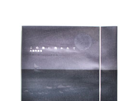
Client: Dandelion Music Communications
Location: Taipei, Taiwan
Packaging Contents: CD
Packaging Materials: Paper
Konouminitakarete / Chihiro Toki ft. Huang Yu-Siang
The theme of ocean views at sunrise, using translucent tracing paper, stacked with layers of paper into a beautiful scenery. White whale also happy harmony in the distance, is one touched by the music turned out the works of the screen.
Read more![]()
↧
↧
December 18, 2015, 12:17 am
![]()
Agency:
43'ozCreative Director: Alex Kodimsky
Designer: Alex Kodimsky
Project Type: Produced, Commercial Work
Client: Kristal Plus (Azerbaijan)
Packaging Content: Wine
Country: Moldova
TM and label design for Azerbaijan wines – «Palitra»
The large Azerbaijan company contacted our studio to develop the TM and label design for a series of wines «Palitra». The presented wines are dry, unblended and produced from indigenous grape variety in particular. The product price is in the upper-middle segment with a distribution on the local market and future export sales.
From day one the idea of using paintings drawn by modern Azerbaijan pictures for label design was offered by our client. At the same time it was necessary to develop an up to date design where the trade mark had to provide instant recognition among other wines on a shelf.
Inasmuch as all the paintings are quite different both in terms of color scale and stylistics, we’ve decided to use the handwritten image of the palette as an eye-stopper, which brings together the whole range of wines.
As a result we have a colorful wine label with conventional European style and a national character in one. The final image of the product obtains its ethnic flavor.
Read more![]()
↧
December 18, 2015, 12:23 am
![]()
Agency: Compagnie & Cie
Designer: Mario Mercier, Simon Roy
Illustration: Alain Pilon
Typography: Coppers & Brasses
Photography: Mathieu Lévesque – Consulat
Website: Yann Beauregard, Jean-Maxime Couillard – Lima Charlie
Project Type: Produced, Commercial Work
Client:
CIRKA DistilleriesLocation: Canada
Our goal was to build a new brand from the ground up for a new spirits craft distillery located in Montreal, Quebec, Canada.
The distillery is focused on creating high quality spirits (vodka, gin and whisky) as an expression of the province's terroir which is rich in corn, malt, rye and botanicals from the Boréal forest. The spirits produced are also very inspired by the city's creative energy so the target was to create something that is part urban with a rural influence, and modern with a rustic edge.
The source of inspiration for the brand (tone, colors, textures, and shapes) was heavily influenced by the distillery itself as well as the area in Montreal in which the distillery is located – an urban industrial area right near the historic Lachine canal. Natural materials such as stone, concrete, wood, copper, oxidized copper, metal, brick, and cardboard were combined as materials used in the space and in the packaging as well. Our CIRKA cocktails are inspired by Montréal's streets, locations, as well as other symbols from our fair city.
The caribou is Québec's national animal and symbolizes nature - we wanted a confident yet playful icon that could symbolize our province rather than use a politically charged symbol. The barrel is a direct reference to distillation and transformation. We decided the icon was important enough to include on the back of the label as well since the flow of liquid in the bottle distorts the icon slightly - especially as the liquid levels go down. We felt it was just as important for consumers to enjoy the bottle from a 360 degree perspective - to enable them to discover something interesting no matter which direction the bottle was facing.
The duration of the project was well over 8 months and we are in production right now for labels and packaging. CIRKA Vodka Terroir will be available for purchase in February 2016 and the CIRKA Gin Sauvage in the spring of 2016.
Read more![]()
↧
December 18, 2015, 12:31 am
![]()
Agency:
Typical. OrganizationProject Type: Produced, Commercial Work
Client:
OliphenLocation: Athens, Greece
The P-Oliphen-ols family of products is your every day fellow traveller to a healthy lifestyle and your multi purpose shielding, every hour of the day. All this is based on the very latest discoveries of science.
Oliphen products are made with a mix containing the powerful antioxidants of olive fruit (hydroxytyrosol) and grape seed extract. In fact Oliphen mix has more than 580mg of total polyphenols content per gram and an ORAC power of approx. 15,000 μmol/TE per gram.
Polyphenols are natural ingredients that you can source from many products, like olive oil, grapes etc. We mainly use olive fruit and grape seed polyphenols. These polyphenols have a high content in hydroxytyrosol, one of nature’s most powerful antioxidants, and also substantial amounts of tyrosol, caffeic and coumaric acid, catechins and anthocyanes.
Read more![]()
↧
December 21, 2015, 9:48 pm
![]()
Agency:
Stranger & StrangerDesign Project Type: Produced, Commercial Work
Location: New York, NY, USA
We’ve always had fun with our holiday production – we’ve done everything from absinthe to playing cards – and this year was no exception. Eau de Stranger: pour homme, pour femme, pour room freshener.
Read more![]()
↧
↧
December 21, 2015, 10:57 pm
![]()
Designer:
Yuta TakahashiProject Type: Produced, Commercial Work
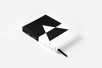
Client: Die Christengemeinschaft
Location: Japan
Yuta Takahashi designed the “Trinität vol.1 and vol.2 Special Edition” written by Michael Debus. This book is based on “Trinity” which he told when he visited Japan in 2013 and 2014.
He tried to face a new world view of trinity which would be able to advance the idea of dualism in this book. To explain the idea perfectly, “We have to go the abstract world once”, he told and tried to lead Japanese to the abstraction. Although, he “failed” (vol.1) because “Japanese loves a tint and fullness of diversity[...] but are not interested in an essential sphere behind that world. [...] because when we changed the view of the world from fullness of life and diversity to unified sphere, there is just a colorless, conceptual, and ‘abstractive’ world.” (vol.1)
So I extruded visually and entirely this abstract world which he failed to express, and made us be able to get to know well about this book means through abstract world. When Japanese people publish a series of two books, we call volume 1 “Joh” (means upper part) and volume 2 “Ge” (means lower part). So we have a general idea which volume 1 and 2 is a set. Then applied to the motif as an abstract image of switch like on and off. And I selected decent triangle and cross as one set for the motif of Trinity.
So the book design as a whole has an impact that intersects contrast, modern, and minimal impressions.
Read more![]()
↧
December 22, 2015, 2:07 am
![]()
Designer:
Grisha SerovProject Type: Produced, Commercial Work
Client:
Rouge Bunny Rouge UK Ltd.Location: United Kingdom
Packaging Contents: Beauty
With products based on the most efficient ingredients and mesmeric, multidimensional colours, Rouge Bunny Rouge is about intelligent beauty and wicked fantasy. To be suitably prepared for our 10th Anniversary in 2016, an Exciting Metamorphosis is taking place.
What's Unique?
Mix of Neo Victorian charm and progressive beauty technologies.
Read more![]()
↧
December 22, 2015, 2:20 am
![]()
Designer:
Grisha SerovProject Type: Produced, Commercial Work
Client:
Rouge Bunny Rouge UK Ltd.Location: United Kingdom
Packaging Contents: Perfume
Quiet grandeur is the unique style of the Provenance Tales collection. During the first years after the launch the Provenance Tales fragrances were presented exclusively in 50 ml natural spray bottles – the perfect size for discovering this luxurious collection. Following various requests from perfume connoisseurs Rouge Bunny Rouge now adds 100 ml natural spray bottles to the range, making all six fragrant treasures ‘Cynefin’, ‘Embers’, ‘Incognito’, ‘Silvan’, ‘Tundra’ and ‘Silhouette’ available in two sizes. The design of the original smoky, textured bottles is tastefully and effortlessly translated into the larger flacons to create a sense of greater harmony. Both bottle sizes come with the newly redesigned, exclusive packaging: the sturdy, heavy, matt black boxes adorned with glossy signature motives.
Read more![]()
↧