December 24, 2015, 2:21 am
![]()
Agency:
Brand SocietyProject Type: Produced, Commercial Work
Client: Cadbury
Packaging Content: Chocolate
Location: Melbourne, Australia
OPPORTUNITY
Favourites is the most joyful thing to bring to any and every social occasion, but for that extra special occasion it needed the ability to step up and be even more joyful and special. To do this the Favourites brand structure had to be flexible and an extra level of engagement needed to be added.
SOLUTION
The solution was to add character! To make it more fun and more festive we created a bespoke, endearing Rudolph illustration that you just have to have. The design was applied to a limited edition tin format and the result was a beautiful festive gift that anyone would be thrilled to receive in their Christmas stocking. The metallic tin substrate was used to give the design a golden sparkle. Rudolph delivers the goods again!
Read more![]()
↧
↧
December 27, 2015, 9:06 pm
![]()
Agency:
IQ HarvestProject Type: Produced, Commercial Work
Client: Kalymera
Location: Russia
Packaging Contents: Meat
Packaging Materials: Paper, bags
Agency IQ Harvest has developed a new brand identity for stores Kalimera. The agency's team has developed a logo, corporate identity, brand book, interior and exterior design shops.
The outlines of the logo of the new brand at the same time like a stamp (stamp) for the animals and for meat packaging bag - in this form is supposed to wrap cuts for customers. As the basic color, the authors chose red, which is intended to emphasize the product of the brand.
To create an atmosphere of graphics experts developed a brand environment - a set of symbols that are related to the brand meaning and the graphics area. Symbols are combined in groups in various combinations and are used as patterns to fill the various forms.
In the interior, the agency has proposed to use not only the logo and the familiar graphic form, but also a tree - to reflect the idea of freshness and naturalness of meat. In addition, there have been several types and sizes of packages suitable for different scenarios shopping, and designer clothes, are reflected in his black premium character of the brand.
Read more![]()
↧
December 28, 2015, 12:44 am
![]()
Agency:
GrantipoCreative Direction: Sergio Daniel García
Project type: Self promotion
Location: Madrid, Spain
Materials: Glass, paper
A great trip taken through an entire lifetime.
To look back after a long journey leaves one with the sensations of the road taken.
Now, during festive holiday dates, it’s that that view of the path we’ve already trodden
that helps us to keep walking in a forward direction in our direction.
Grantipo wishes you a long and happy journey.
We extend our sincere gratitude to these 50 people, the friends, the clients that makes our excitement and enthusiasm grow steadily.
Read more![]()
↧
December 28, 2015, 12:53 am
![]()
Agency:
GrantipoCreative Direction: Sergio Daniel García
Client: Edaqua
Project type: Produced. Commercial work.
Location: Madrid. Spain
Materials: Glass, paper
Momentum is a coffee crafted to satisfy the most demanding palates.
The modifications and evolution the bean mix and roasting process has experienced over time were noted on slate boards by master coffee experts.
Being faithful to this tradition, we created this packaging direction a visual metaphor for the ‘canvas’ upon which original recipe evolution were documented.
Read more![]()
↧
December 28, 2015, 1:06 am
![]()
Designer:
Robert NevilleProject Type: Self Promotion
Location: Budapest, Hungary
Packaging Contents: Perfume
About Scotch & Soda
Scotch & Soda has been around since the ‘80s, but the Amsterdam-based fashion brand as we know it today originates in a brave new start in 2001, when three new owners joined forces and brought to the table their broad experience and shared love of making great apparel. After Scotch & Soda was re-launched for Spring Summer 2002, Scotch Shrunk was added for Spring Summer 2008. Literally shrinking men’s styles to little brother or son sizes was a completely new take on kids wear, and Shrunk made waves no-one at Scotch had dared dream of. This success was soon followed by the launch of a women’s collection: Maison Scotch entered the market with the Spring Summer 2010 collection, celebrating classic French style and adding a touch of tough street wear elements.
In late 2010, the first Scotch & Soda perfume was launched by the name of Barfly, making a dream of the brand come true. Little sister R’Belle launched soon after in Spring Summer 2011, exploring a unique and modern take on girl’s apparel. Scotch & Soda’s youngest and most ambitious project Amsterdams Blauw hit stores in December 2010; a compact, high profile denim collection that could only come from the Scotch kitchen.
Scotch & Soda currently boasts over 100 stores worldwide, more than 7000 other sales points and a fully up to date online presence with and integrated webstore, blog and social media. The brand is classic in many ways, but young and progressive when it comes to bringing great clothes to the market place.
Description
Barfly is the signature fragrance of Scotch & Soda, a perfume that truly represents the brand's desire for individuality and love of free spirits. Much like the clothes, this scent has its own character and is full of details. Featuring fresh top notes of citrus-herb, middle notes of lavender and jasmine, and notes of sandalwood, musk and Madagascar.
Read more![]()
↧
↧
December 28, 2015, 1:24 am
![]()
Agency:
TripDesigner: Miguel Quiroga
Project Type: Concept
Location: Mendoza, Argentina
Packaging Contents: Beer
Packaging Materials: Glass bottle
Black Bird beer is the one for the costumers tired of the bored flavor of beers design for massive consumption.
Black Bird is a handcraft product, made by an small group of people in a limited quantity, that assure the right care and attention it bottle deserves.
The Black Bird project was developed by Miguel Quiroga and Matias Basoalto at Estudio Trip. The idea was design a label that display the handcraft delicate work of this beer production along with the classical german label style.
The lettering design of the brand was completely handmade to match with the handcraft ideal of the product.
Read more![]()
↧
December 28, 2015, 1:53 am
![]()
Agency: Hexagram
Project Type: Produced, Commercial Work
Client:
Ron DuranLocation: Panamá
Packaging Contents: Rum
Packaging Materials: Cardboard
Special packaging for Ron Duran 12 Years.
Ron Duran is handcrafted rum created by our recognized master blender Francisco “Don Pancho” Fernandez as a tribute to Panama´s most famous boxing champion of all time. This exquisite award winning flavor profile is achieved by a blend of rum aged for 12 years in white oak whiskey barrels. Duran rum truly captures the essence of patience, passion, perseverance and triumph.
Read more![]()
↧
December 28, 2015, 2:08 am
![]()
Agency:
ZUP _Project Type: Produced, Commercial Work
Packaging Contents: Socks
Packaging Materials: Paper
Location: Perugia, Italy
This pack was make to travel around the world. The peculiar triangle shape and the dimension are wisely conceived for all sort of shipping. The box is assembled from a one sheet of black thick paper, no paper-clips and glue are used. A white silk-screen printing highlights the logo.
Read more![]()
↧
December 29, 2015, 12:55 am
Designers:
Mikael Selin and
Depero QuadrigeaProject Type: Produced, Commercial Work
Client:
Gothenburg SodaLocation: Gothenburg, Sweden
Packaging Contents: Non Alcoholic Soda
Packaging Materials: Glass
Everything that is microbrewed is not beer. Simon Svensson from Sweden recognized the absence of non alcoholic tasty beverages at restaurants and bars in Gothenburg. And started GBG Soda (Gothenburg Soda). The first to flavours to hit the market is Ginger Ale and India Pale Soda. Simon experiments with flavours, spices and combinations to give that extra sting to it.
The packaging design is a colourful mix of fruits, handwritten typography and local landmarks from and around Gothenburg.
A local brew that tastes like far far away.
Read more![]()
↧
↧
December 29, 2015, 1:35 am
![]()
Agency:
4Press Creative AgencyProject Type: Produced, Commercial Work
Client:
VEKKALocation: Odessa, Ukraine
Packaging Contents: Sausage, Meat
Packaging Materials: flexographic printing on artificial membrane
VEKKA - a leading manufacturer of sausage-meat products in Odessa, Ukraine.
The project was created in the framework of rebranding of the packaging. The material was flexographic printing material made on an artificial membrane.
The first stage of work was a careful study of the consumer. Among the main difficulties that were able to identify: 1) the difficulty in finding the right varieties of sausage, 2) unequal distribution among all the participants of the banquet. Based on the observations, it was defined the main direction of the package rebranding.
Solution. 1) On the front of the pack to portray the icons of animals for quick search the right varieties of sausage. 2) On the back to hold the oblique parallel lines for a clear and uniform distribution of the product. Now not the mathematical calculations but simple design directs you while cutting the sausage.
Just taking the stick of sausage in hand you realize how much you can do sandwiches to children for school.
Read more![]()
↧
December 29, 2015, 1:45 am
![]()
Agency:
CreamosCreative Director: Jorge Montoya
Graphics: Ricardo Cardona
Copy-writer Carlos Montoya
Project Type: Produced, Commercial Work
Client:
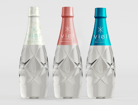
TRIARKALocation: Medellín, Colombia
Packaging Contents: Water
Packaging Materials: Plastic
The massive beverages market required a different offer, with good design and different content altogether.
Our client developed the first and only watermark hydrolyzed collagen in Colombia, created to reduce the traces on your skin left by time and age.
So we created a clean image, with simple and clean design, with beauty to attract an audience that is interested in preserving it.
Read more![]()
↧
December 29, 2015, 2:08 am
![]()
Agency:
Reynolds and ReynerProject Type: Produced, Commercial Work
Client: Seiba Group
Packaging Content: Sparkling wine
Location: Kiev, Ukraine
Collection of sparkling wine with Italian charm
Lazur sparkling wine is made mingling selected wine materials produced in Italy. The brand’s name traces its Italian roots being associated with the Cote d’Azur (the Russian for «Azur» is «Lazurnyi»), relaxation and holidays, the Riviera, coasts and beaches, and the sea of course. The very idea is also used in its packaging where the label resembles a sea navigation compass creating the adventurous and pleasant atmosphere.
We examined various elements of Italian heraldry and created the coat of arms showing lions, knight helmets, ribbons, crosses and even a five-pointed star each having its original meaning and background. Additionally to the bottle and outer box we designed an exclusive set which consist of a wine cooler and six irregular-shaped champagne glasses that symbolize ship sails floating through the waves to meet the unknown.
Read more![]()
↧
December 29, 2015, 9:53 pm
![]()
Agency: DDB Egypt
Sr. Graphic Designer: Smash Khaled
Project Type: Concept
Location: Egypt
Packaging Contents: Dessert, juice, chocolate, cake, jam, jelly, zalabia, zalabya, basbousa, creme caramel, cream
Neat simple conceptional Designs for Holw el Sham dessert products.
Following the simplicity trend in the packaging design world, we demonstrated the beauty of the products in simple way....depending only on product details and indicative colors to be distinguished easily on the shelves at the markets according to its category and type.
Read more![]()
↧
↧
December 29, 2015, 10:33 pm
![]()
Designer:
Mareks MelecisProject Type: Produced, Commercial Work
Client:
Grower's CupLocation: Denmark
Packaging Contents: Whiskey, coffee brewers, sugar and cream
Packaging Materials: Corrugated fiberboard and paper sleeve
The Irish Coffee, ready-to-make kit.
This kit, which includes a bottle of Tullamore D.E.W., 5 disposable coffee brewers (which can make 2 cups of coffee on-the-go), 150 g brown powder sugar called "Farin" and 200 ml UHT cream. This kit makes you 10-15 glasses of Irish Coffee. All you need is hot water.
Read more![]()
↧
December 29, 2015, 11:49 pm
![]()
Agency:
CF Napa Brand DesignCreative Director David Schuemann
Design Director Kevin Reeves
Senior Designer Antonio Rivera
Project Type: Produced, Commercial Work
Client:
Boundary Breaks VineyardLocation: Napa, USA
Packaging Contents: Wine
Although the climate of the Finger Lakes is ideally suited for producing world-class Rieslings, the region isn’t commonly associated with exceptional wines… at least not yet. When Boundary Breaks came to CF Napa to update their packaging, the challenge was to create a more sophisticated design solution that matched the quality of the product inside the bottle. Furthermore, the packaging solution needed better "shelf pop", a greater level of differentiation between SKUs, and a quality promise that appealed to the target consumer.
The name “Boundary Breaks” comes from the two ravines – or “breaks” in the landscape – on the northern and southern boundaries of the vineyard and is a direct nod to the appellation where the wine is grown. To communicate the "terroir-driven” style of the wines, CF Napa re-imagined the topographical map motif to make it look less scientific and more evocative and tactile. We added a brush stroke color swatch scheme that provides the right amount of hand-crafted, approachable cues, a clear system of differentiation between their various Rieslings, as well as some shelf impact for these extraordinary wines.
Read more![]()
↧
December 29, 2015, 11:58 pm
![]()
Agency:
Antonia Skaraki A.S.Project Type: Produced, Commercial Work
Client:
Coffee LabLocation: Athens, Greece
Packaging Contents: Coffee
Packaging Materials: Plastic, Paper
Argus was born especially for the specialty coffees of Coffee Lab Microroasters. His friendly gaze captured our attention immediately, promising faithful companionship, a steady and friendly resolve, an earthly stability and the credibility of an indulging, sensory journey! He offered to guide you and us together, step by step in a design Odyssey, ending up in the Ithaca of taste loyalty, warmhearted service and delightful beverage drinks!
Read more![]()
↧
December 30, 2015, 12:10 am
![]()
Agency:
CRPSr. Creative Director: Cole Johnston
Sr. Designer: Natalie Olbrantz, Josie Haney
Photographer: Amy Kumler
Project Type: Produced, Commercial Work
Client:
Natural DecadenceLocation: Humboldt, CA, USA
Packaging Contents: Pie
Packaging Materials: Paper
Natural Decadence is an allergy friendly bakery and catering company, whose mission is to “please every palate” with their delicious gluten free baked goods. While Humboldt County, CA is home, their flavorful goods are available at Whole Foods and natural grocery stores nation-wide. As a solution to accommodate the company’s growth, owners Rosa and Milia contacted CRP to develop a brand identity and packaging design for their retail-facing sub-brand Raised Gluten Free.
Inspired by the lighthearted personality of the owners and their artisanal approach to baking, CRP hand-illustrated a custom wordmark and iconography system with the intent of appealing to two primary consumers: health-conscious young professionals and mothers with children who have food allergies. For each target market, CRP developed a unique set of guidelines. These elements set the foundation for the packaging design, which features photography by renowned lifestyle photographer Amy Kumler. Each element serves a unique purpose to help shoppers easily identify product lines, flavor profiles, and, most importantly, allergen information.
The end result is an identity system and packaging program that is smart, flexible, and embodies the cheerful, handcrafted roots of the Natural Decadence brand.
Read more![]()
↧
↧
December 30, 2015, 12:15 am
![]()
Designer:
Nacim ShehinProject Type: Concept
Location: Mexico City
Packaging Contents: Soda, Coke-Cola
Packaging Materials: Aluminium
I really admire the design this brands have so this project was born from the idea of bringing them together. From personal experience I can say that I like minimalistic design better than other types of designing, that’s why I only used the silhouettes of the Disney characters instead of using the original pictures.
I don't like to be stereotyped into any kind of designing, I feel like people who think outside of the box stands out more that people who follow certain designing limitations. I think the most important thing is to keep on trying until you feel completely happy with the thing you're creating.
I believe that the key to designing is to not limit yourself and just let the ideas flow as they come together in one piece.
Read more![]()
↧
December 30, 2015, 2:29 am
![]()
This year, we received more than 7,000 package design submissions.
These
top rated posts were the most visited and the most popular packaging projects on our
social platforms in 2015. It is fascinating to see the diversity in design, projects made the cut, and what kind of design themes were trending.
Check out all 50 below, and let us know what projects inspired you and what could be the emerging trends for 2016. Thank you all so much for your support, it is you who made us what we are today.
Read more![]()
↧
![]()
Agency:
Moon Troops - Creative AgencyCreative Director: Motiejus Gaigalas
Creative & Design Team: Motiejus Gaigalas, Roberta Paskeviciene, Vytenis Lukosius, Paulius Strazdas
Video Post Production: Vilius Ūksas
Project Type: Handmade Limited Edition (25 bottles)
Location: Kaunas, Lithuania
Packaging Contents: Wine
Packaging Materials: Grass & Wood
This year we decided to celebrate Christmas with creative workshop, where we wanted to show what we know best – creating brand logos and package design, yet differently than usually. The decision to prepare such workshop came to our minds after thinking about the real meaning of Christmas and the value of hand-made gifts. Therefore, for our customers we have prepared a limited edition wine package. As a present we chose an exclusive Lithuanian raspberries wine, created by one of the famous Lithuanian wine-makers Česlovas Ramoška.
As for a name we chose a mystified word – Moonberry, which would create and association with Moon Troops and would send a message that it’s a wine made out of berries, not grapes.
Inspired by Christmas spirit, we developed a packaging, which would encapsulate the idea of naturalness – the label is made of natural cherry wood fiber. The box is made of pine and stained in russet color. On the inside, the wine is covered with a fragrant natural hay. The main idea of this product – to symbolize new discoveries in an exclusive, unique and hand-made packaging.
The whole process is immortalized not only in pictures, but also in a short video clip. Our clients have found a link to a greeting and a video clip of whole creative process. This was a truly different Christmas concept, which enabled us to look at everything creatively and test ourselves from a different angle.
Read more![]()
↧