December 3, 2018, 1:32 am
Packaging of the World presents the top 10 posts for the month of November 2018. They are selected according to their post views, social shares, social likes, re-tweets repins and people reached. All these data were collected on this website and also on different platforms like our
Facebook,
Twitter and
Pinterest page. These projects will definitely inspire you for your next design project, you can also
submit your packaging project here!
Read more![]()
↧
↧
December 3, 2018, 11:00 pm
Design:
Simón Londoño SierraProject Type: Produced, Commercial Work
Client:
La Caleñita, hand made JewlryLocation: Cali, Colombia
Packaging Contents: Medium bag, samll bag, medium box, small box.
Packaging Substrate / Materials: Hand-made paper, plastic mate laminate, golden foil.
Printing Process: Letterpress
La Caleñita is a Colombian brand dedicated to distribute hand-made products created by local artisans.
For the jewelry line we designed this special packaging set of two kind boxes and bags which could communicate the high quality of this line products and being able to separate them of the other products lines. The illustration tells the power of the hand-made artwork, the process, the magic and the femenin focus the jewerly has.
Golden foil printed on letterpress, used to emphasize on the gold material most of the jewels are made of.
Read more![]()
↧
December 3, 2018, 11:02 pm
Design: Alice Macarova
Project Type: Produced, Commercial Work
Client:
Flamme sweetsLocation: Saint-Petersburg, Russia
Packaging Contents: Sweets
Packaging Substrate / Materials: Paper, plastic
Printing Process: Flexography, Digital printing
This project was created in 2018. Flamme sweets have a very special concept. Package design gives you an opportunity to create your own, custom gift. At first we designed a basic package without any illustrations, just logo and brand color. After it we start to create illustrative covers. Each cover has a story. Costumers can choose covers according to situation. For example, I drew some covers about popular celebrations, such as New Year, 8th March, Teachers day and so on. Also we create emotional covers: “Sorry”, “I love you”, “Many thanks”. People can chose flavors according to its taste, they can chose cover that make box unique.
All illustrations are digital. I use IPad Pro and Procreate application. This stuff makes me fell like I work with paper, but it more suitable for printing. Each picture is decorated with gold embossing.
Read more![]()
↧
December 3, 2018, 11:02 pm
Design:
Fabula BrandingProject Type: Produced, Commercial Work
Client: Raduga LLC
Location: Minsk, Belarus
Packaging Contents: Cat Food
Packaging Substrate / Materials: Plastic
Printing Process: Printing
Context
The customer started a new line of business and launched the production of cat food. The trademark had to compete with recognizable brands such as Darling, Friskies, KiteKat. That is why the company needed to research the category and to determine the niche and target audience before entering the market. Moreover, it required a package design solution to establish efficient communication with its customers.
Strategy
To solve the customer’s task, a team of Psychea consulting company developed a marketing strategy and a product range portfolio and built the brand’s platform and architecture. Psychea also created the name LeeLoo and a concept for visual identification and package design.
The core target audience of the brand is formed by young women that have just begun to live separately from their parents. They want to fill their new homes with feelings and emotions and therefore bring in pets. The women care about the animals, their health and well-being. LeeLoo is a brand for young housewives, a responsive and professional helper. Like them, the company believes that love is not just words.
Package Design Development
The purpose of visual communication was to form trust in the brand as in an expert caring about the pets, taking care of their health, and taking into account their individual peculiarities.
Featuring animals on packages is a popular solution in this segment. For the product to be visible in stores, we put not just a cat, but the picture of a pet with its owner in the center of attention. Each woman’s care and kindness communicate the nature of LeeLoo. The emotional image is supported by plastic forms in the composition and low-contrast colours.
The infographics in the lower block of the package gives a brief overview of each product’s composition and the benefits of each component. Key information about the composition is readable at first glance making it easier to choose a product and convincing a customer of its safety. This makes the product particularly relevant for inexperienced pet keepers.
Read more![]()
↧
December 3, 2018, 11:03 pm
Design:
Sasquatch AgencyProject Type: Produced, Commercial Work
Client:
Widmer BrothersLocation: Portland, USA
Packaging Contents: Beer
Packaging Substrate / Materials: Aluminum
Building on the longest standing craft beer sponsorship in the NBA, Widmer Brothers Brewing and the Portland Trail Blazers have launched co-branded 16-ounce cans of the brewery’s flagship beer, Hefe. For the city that loves its beer and hoops, the nine-time Great American Beer Festival medal-winner Hefe is now in Blazers home jersey themed cans to celebrate the long-running partnership.
“We’ve been a proud partner of the Portland Trail Blazers for over a decade,” said Rob Widmer, co-founder of Widmer Brothers Brewing. “It doesn’t get better than Hefe in the awesome Trail Blazers cans. This is a new milestone for us, as well as Portland sports fans.”
Widmer Brothers Hefe is the brewery’s cloudy flagship beer with bold, clean flavors and pronounced citrus and floral aromas-hallmarks that define American-style Hefeweizen.
From December 3 through the end of the 2018-2019 NBA season, the limited edition 16-ounce cans will be available Widmer Brothers’ North Portland pub, the Moda Center, bars throughout Oregon, as well as at grocery stores in four packs.
To celebrate the launch of the cans, Widmer Brothers will host an official tasting at the Moda Center on December 14 for the Portland Trail Blazers – Toronto Raptors game. Fans can enjoy a free taste of the Hefe, and see the new co-branded cans. A winner will also be selected during the “Lucky Row” giveaway during a timeout, and will receive a pint card to Widmer Brothers.
Over the decades, Hefe has elevated Widmer Brothers Brewing to national acclaim, with the beer winning 12 Great American Beer Festival and World Beer Cup medals. It most recently won back-to-back gold medals at the Oregon Beer Awards in 2016 and 2017, and is still the top-selling craft beer in Oregon.
Read more![]()
↧
↧
December 3, 2018, 11:04 pm
Design:
Abio design lab studioProject Type: Produced, Commercial Work
Client: Eveg cosméticos
Location: Porto Alegre, Brazil
Packaging Contents: Cosmetics
Packaging Substrate / Materials: Plastic
The brand's visual identity was developed from concepts derived from the essence of eveg: mother nature and our spiritual bonds with her. Thus, a synthesis between logo and symbol was sought through a modern typographic family and the silhouette of a drop in the bulge of the letter "g". Composition that originated the main visual signature of the brand, as well as its secondary version, represented only by the letter "g" together with the decoder of the brand "vegetal extract".
Read more![]()
↧
December 3, 2018, 11:04 pm
Design:
Wynda Dwi AmaliaProject Type: Produced, Commercial Work
Client:
JansLocation: California, USA
Packaging Contents: Tea
Packaging Substrate / Materials: Paper, Glass
This is project pitching that I created for Jans corp.
What's Unique?
Ginger Crystal is the product that already exist in Jans food, in this case I try to create new look for this design. The concept that I try to build is elegant and look exclusive but still authentic.
Read more![]()
↧
December 3, 2018, 11:05 pm
Design:
Just Be Nice studioArt-director:
Igor KiselevPackage designer: Anastasia Moskvina
Showbox designer: Alina Vengerskaya
Junior designer: Barbara Strelnikova
Project manager: Yana Gerasimova
Project Type: Produced, Commercial Work
Client:
O12 NutritionLocation: Moscow, Russia
Packaging Contents: Chocolate
Packaging Substrate / Materials: Paper
Printing Process: Flexography
The Moscow studio Just Be Nice presents a new project, created in the framework of the long-standing collaboration with Moloko Ingredients + Foods, the / an expert in milk processing and high-protein edibles’ production.
Under the brand O12, the company has developed a new product — protein chocolate. This high-protein product is made of top-quality cacao beans, has a silky, delicate creamy flavor, and doesn’t contain sugar, preservatives, artificial flavorings and colors.
О12 has produced three flavors of the chocolate: milk, milk with hazelnuts, and milk with almonds. It made the designers think of pairing each flavor with a sport, and that’s how the idea of triathlon came up. That’s how athletes taking part in multisport race ‘settled in’ on the chocolate packaging.
The task was to communicate an easy-going attitude towards sport, as the brand O12 promotes healthy foods for people leading an active lifestyle, not sport nutrition. Sport is accessible for everyone, not only professional athletes, and the illustrations catch this spirit using ‘amateur-like’ style, based on flowing lines, with the athletes wearing simple sport outfits, and the plot linking sport with pleasure.
Read more![]()
↧
December 3, 2018, 11:05 pm
Design:
DOUPLAProject Type: Produced, Commercial Work
Client: ZWACK
Location: Budapest, Hungary
Packaging Contents: Spiced Gin
Packaging Substrate / Materials: Glass Bottle
Kalumba Madagascar Spiced Gin is the newest product development of the largest Hungarian family-owned spirit company Zwack Unicum Plc - having more than 200 years experience in bitters & spirits. The product development took 4 years, the branding, packaging and marketing project spanned over 2 years, landing on the shelves this summer.
Kalumba is a fig based gin with spices & herbs from Madagascar. The “Kalumba” name derives from one of the main ingredients (Jateorhiza palmata) common name “Calumba”. It has a rich amber colour, tastes with a citrus flavour embraced with the fig characteristics. It is unique among all gins is that it is best enjoyed in a shot (on chilled temperature) or with ginger ale & lime. The brand’s symbol is the polygon lemur head - an iconic indigenous animal of Madagascar.
Read more![]()
↧
↧
December 4, 2018, 11:39 pm
Design:
Claudia Galindo Ch.Project Type: Produced, Commercial Work
Client:
BilabìPhotographer: Tiziana Bellanova
Location: Bari, Italy
Packaging Contents: Beer
Packaging Substrate / Materials: Aluminium / Paper label
Printing Process: Digital Printing
Camelia Bavaria is a golden-coloured, full-bodied green tea Pale Ale. A craft beer produced by Bilabì, a brewery located in Bari, southern Italy. In collaboration with Terza Luna, a local specialized tea shop, they decided to produced an original beer including green tea (camelia sinensis) in its ingredients.
The label was designed taking into account the ingredients of this beer based on green tea, grapefruit and the hop mandarina bavaria. The orange color was chosen to highlight the mandarin and the grapefruit. The dark blue was selected to give contrast and to grant the label a more classic look. The pattern provides a fruity herbal feel to it, which is the main feature of this beer’s aroma and flavor.
Read more![]()
↧
December 4, 2018, 11:39 pm
Design:
OmdesignProject Type: Produced, Commercial Work
Client:
Quinta Nova de Nossa Senhora do CarmoLocation: Matosinhos, Portugal
Packaging Contents: Wine
Packaging Substrate / Materials: Glass bottle, paper
Printing Process: Direct printing with low relief and varnish
Omdesign was responsible for the creation of the new look of Pomares, a wine brand from Quinta Nova de Nossa Senhora do Carmo, a wine producer with more than 250 years of history. The purpose of this renewal was to highlight the range differences and to assign it a more special touch.
‘Pomares’ now reveals a more clear balance and harmony between the different components that integrate its new labelling graphic composition, that also highlights the illustrations of the Quinta Nova de Nossa Senhora do Carmo emblematic orchards, which is constituted by two elements. The Quinta Nova de Nossa Senhora do Carmo umbrella is kept at the bottom of the label, with a new schist grey colour, reporting to a characteristic feature of this wine region recognized as the oldest in the world.
The three wines that compose the Pomares range – two whites and one red – are now presented in pastel tones, representing the profile of each wine.
With this renewal, Pomares, a brand known by their high quality gastronomic wines, wants to bring the millennial generation closer and to meet the expectations of this generation of consumers that enjoy new experiences and flavours.
Read more![]()
↧
December 4, 2018, 11:40 pm
Design:
Anderson RestrepoProject Type: Concept
Location: Rionegro - Antioquia, Colombia
Packaging Contents: Lipstick, mascara, cc cream
Packaging Substrate / Materials: Aluminum, plastic, glass
Behind every woman there is a story that wants to be told, a story that is always accompanied by an essence as unique and unforgettable as those who live it, JANEMUA with its new collection allows today's woman to celebrate a new story with a great start, with a new design inspired by a glamorous life full of luxuries and pleasures making her feel, an attractive, provocative and irresistible woman.
Read more![]()
↧
December 4, 2018, 11:41 pm
Design:
AbracadabraProject Type: Produced, Commercial Work
Client:
Vinuri de ComratLocation: Moldova
Packaging Contents: Wine
Packaging Substrate / Materials: Glass bottle
Printing Process: Digital printing, Screen printing, Foil stamping, Varnish
The packaging reflects freshness of the wine and represents its unique style of Comrat, Gagauzia. The graphics of the label show the parts of the wineyards, color of wine and rolling hills. To achieve goal we have used digital print on textured paper, screen printing and foil stamping. Parts that are showing rolling hills of Gagauzia, we decided to varnish to betray additional tactile sensation.
Read more![]()
↧
↧
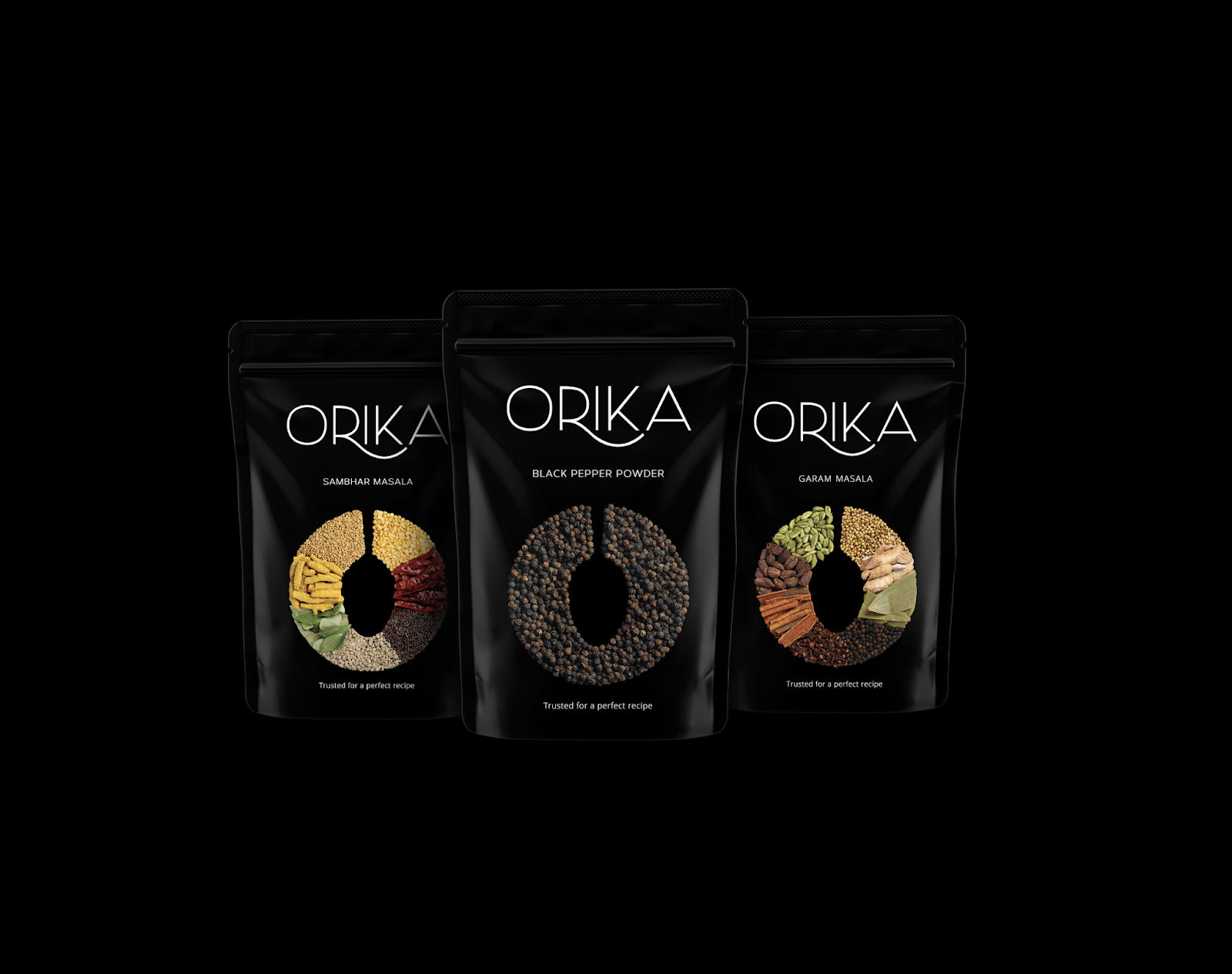
December 4, 2018, 11:41 pm
Agency: Freddy & Naved Communications
Creative Director: Urvi Jaidka
Photographer: Humam Syed
Project Type: Produced, Commercial Work
Client: Paras Spices
Location: New Delhi, India
Packaging Contents: Spices
Packaging Substrate / Materials: Aluminium
Printing Process: Flexography
Our brief was to build a brand of Indian spices highlighting the authenticity and the freshness of the products while keeping it very minimalistic.
The ‘O’ on the packaging represents 'Orika.' The contemporary cut in the ‘O’ with a spoon is an intricate way of creating an illusion between ‘O’ and the spoon. This illusion is a powerful tool in helping build a recall for the brand. Going forward, we amalgamated the same design with herbs and spice shots, to give it a clean and defined look. We believe in the power of minimalism and hence wanted to create something clutter breaking in the field of herbs and spices. The modern typography of the font and the extra emphasis on 'O' has made our clients work harder to produce more.
The colour black was chosen after a careful study of the spice industry packaging. We understood that using black will surely create a deafening effect in the market as most other packagings are colour coordinated with the spice it sells. It was a risk and the risk worked.
Read more![]()
↧
December 4, 2018, 11:41 pm
Design:
Bw / GrainProject Type: Concept
Location: Montijo, Portugal
Packaging Contents: Cooking sauce
Packaging Substrate / Materials: Aluminium, paper
Printing Process: Digital printing
The kitchen of a modern family is made up of small shortcuts that allow them more quality time without losing the taste and authenticity of traditional cuisine. This is how Hannah's Cooking Sauce was born.
With illustrations representing their ingredients, these sauces are a tasty and healthy addition to any kitchen. A balance between tradition, the concept of "homemade" healthy food, suggested through illustration, and a dash of digital and color to put the product at the forefront. The result: A packaging that captivates and sells the product.
Read more![]()
↧
December 4, 2018, 11:42 pm
Agency:
BrandsummitDesigner:
Alex MonzóProject Type: Produced, Commercial Work
Client:
Bodegas LatorreLocation: Valencia, Spain
Packaging Contents: Wine
Packaging Substrate / Materials: Glass bottle
A daily memory. As usual as a Sundays' meal with the family. One that becomes "An Expected Moment". This is how Parreño is, regular but desired, like a sunrise or sunset. A wine for every day, to share with the ones that always have been there. A beverage with a design that highlights the colors and the lights of everyday moments.
Read more![]()
↧
December 4, 2018, 11:43 pm
Agency:
Just Be Nice studioArt director:
Igor KiselevDesigner: Alina Vengerskaya
Project Manager: Yana Gerasimova
Project Type: Produced, Commercial Work
Client:
Moloko IngredientsLocation: Moscow, Russia
Packaging Contents: Ice cream
Packaging Substrate / Materials: Plastic
Printing Process: Flexography
Moscow studio Just Be Nice designed a package for the new ice cream “Semenych".
The task was to design a simple and recognizable, but universal packaging. Such product can be found on the shelves of regular grocery stores and premium supermarkets at the same time.
Ice cream "Semenych” has two tastes: halvah and halvah with chocolate chips. For each taste, we have chosen simple and, at the same time, expressive color associations: red and blue.
Read more![]()
↧
↧
December 4, 2018, 11:43 pm
Design:
Merril ClederaProject Type: Concept
Location: New York City, USA
Packaging Contents: Beer
Packaging Substrate / Materials: Glass Bottle
Printing Process: Digital Printing
As the popularity of craft beers continues to accelerate, competing aesthetics have emerged: the two most common styles are spartan, logo-forward, sans-serif minimalism and over-the-top, colorful displays of tongue-in-cheek humor.
The goal with Wallop was to maintain a certain degree of approachability while evoking the creative science of craft beer brewing. Making Wallop boring and intimidating is definitely not a good idea. Thus, the best design that would fit the Wallop brand is a balance in the contrast between a simple bold sans-serif logo and unpretentious geometric illustrations prominently featuring figurative, natural elements.
Read more![]()
↧
December 4, 2018, 11:44 pm
Design:
Hired Guns CreativeProject Type: Produced, Commercial Work
Client:
Mill St. BrewingPhotographer:
Sean FenzlLocation: Canada
Packaging Contents: Beer
Packaging Substrate / Materials: Aluminum
In every town, there is a Mill Street. It is the cornerstone to any settlement. It brought life and sustenance. It formed communities. It created cities. Before a Main Street or a Park Street, there was Mill Street.
Mill Street Brewery is an iconic Canadian brewery based in Toronto’s historic Distillery District. When it opened in 2002 it was the first commercial micro-brewery to see those old cobblestone streets in over 100 years. Today, Mill Street boasts six brewpubs across the country, and between their main brewery and the brewpubs they brew more than 150 unique beers every year. They’ve won Canadian Brewery of the Year at the Canadian Beer Awards three times in a row and took home six World Beer Awards gold medals this year alone.
Mill Street turned to Hired Guns Creative for a rebrand in the fall of 2017. Our challenge was to take a brewery who had grown far beyond their humble origins and redevelop their designs in a way that better told their unique story, all while keeping them connected to their Canadian roots.
Read more![]()
↧
December 4, 2018, 11:45 pm
Agency:
Design WombCreative Director & Designer: Nicole LaFave
Project Type: Produced, Commercial Work
Client:
Flying Goat CoffeeProduct Photography:
Teri Lyn FisherLocation: San Francisco, CA, USA
Packaging Contents: Coffee
Packaging Substrate / Materials: Paperboard
Printing Process: Offset
Flying Goat Coffee is a San Francisco Bay-Area based coffee company that sells exceptional, direct-sourced coffees which are roasted daily and sold online or in their Healdsburg and Santa Rosa shops. Design Womb partnered with the company to develop and deliver a new brand identity and packaging design that would really reflect the owner's deeply rooted coffee expertise and the quality of what they do in all things coffee.
The brand's makeover included redesigning their logo and introducing a new packaging design system utilizing a more eco-friendly paperboard box made entirely out of recycled materials and inks. We developed a totally custom branded base box structure which pairs with a flexible labeling system allowing the brand to use the same base box with different whole bean coffee labels as their offerings change throughout the year. We've also recently helped the company with their new branded compostable coffee bags.
Crisp, clean white is paired with bright approachable color for a modern, yet slightly earthy and utilitarian color palette. The package design balances beautiful white space with the brand's custom repeat pattern which was created out of geometric symbols we designed for different types of coffee offerings such as blends, single origins, decaf, and espresso beans. Each box's interior is flooded with a deep inviting navy blue color housing a beautiful transparent bag of whole bean coffee.
Flying Goat Coffee is all about high quality and an elevated coffee experience, so the logo also captures a bit of the "flying" aspect of Flying Goat, through its simple elevated coffee icon and clean modern typography. Our art direction for this product photography also takes a no fuss, high quality, coffee done right approach by keeping things simple with a little fun infused.
Read more![]()
↧