Quantcast
Channel: Packaging of the World - Creative Package Design Gallery
Viewing all 18585 articles
Browse latest View live

Richmond Sausage

$
0
0


Design: WowMe Design
Creative Director: Andy White
Jon Cornish: Senior Account Manager
Project Type: Produced, Commercial Work
Client: Kerry Foods - Richmond Sausages
Location: UK
Packaging Contents: Sausages
Packaging Substrate / Materials: Film, Paper
Printing Process: Flexography

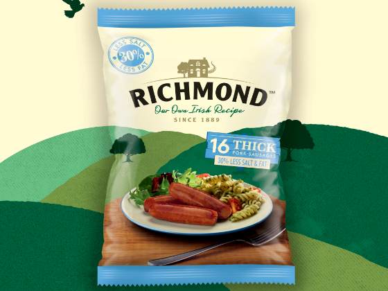
Kerry Foods briefed WowMe Design to create a pack design for their new leaner Richmond sausage.

A favourite in the UK’s shopping basket, Richmond Irish recipe sausages are definitely a brand with strong heritage. Their new 30% less salt and less fat sausage appeal to those looking for a healthier option for their plate.

Andy White, Creative Director of WowMe Design remarked “It’s great working with Kerry Foods and the Richmond brand. Shoppers are loyal to Richmond and love their products, so it was important that we created a design that retained those recognisable cues you’d expect of the brand but developed a fresh feel to support the healthier choice message”...He added, “We are really excited about the new look for this range extension for Richmond, the new packs look really strong and have a real standout in the frozen aisle.”

The new packs are now appearing on shelves in all major retailers across the UK.


Battle Royale E-Liquid

$
0
0


Design: Raz Miyara
Project Type: Concept
Location: North Hollywood, California
Packaging Contents: E-liquid
Packaging Substrate / Materials: Paper and plastic
Printing Process: Digital Printing and spot UV

Taking the standard 60ml e-liquid box sizes and giving it a serious twist! Battle Royale E-Liquid is an e-liquid brand that focuses highly on color, design, and functionality. The box itself fits a 60ml e-liquid bottle nicely but there is something that sets this brand apart. Each flavor of the brand is represented by artwork of different types of warriors from all around the world and throughout time (Viking, Samurai, Spartan, etc.). The front of the box is the warrior in their "Victory" pose and the back is the warrior in their "Defeat" pose. Each box has 2 bottle sized holes on the perpendicular sides where a customer could pull the bottle out of the box (from the top), slip the bottle through the holes, and spin the box around the bottle to play a game of chance with friends or family... WILL YOUR WARRIOR BE DEFEATED OR WILL HE TASTE VICTORY... the Battle Royale will decide.

Read more

Supermarket Klass

$
0
0


Design: Design studio Glad Head
Project Type: Produced, Commercial Work
Client: Supermarket chain Klass
Location: Kharkov, Ukraine
Packaging Contents: Cookery, bakery products, burgers, noodles, candies
Packaging Substrate / Materials: Plastic, Cardboard, paper

There are a lot of supermarkets in our country. They all are similar to each other big and light. Each of them has a lot of fish and vegetables, a large variety of soap and buns but in deed there is no supermarket itself.

This story is about one supermarket which doesnt want to be as the next one with flat, borring taste. So it decided to start talking to its visitors. But how? In such a huge supermarket there are so many people and they all are different. How to be well-liked to everyone? If you cant get on everyone, let it be. We decided to create an intagible hero whose image will be created by his owner. For someone It can be a longtime school friend who they were fighting with using baguette swords or a girlfriend who was afraid of any bread crumb poising her neat figure and for someone it can be his granny who adds her own secret ingredient-love into every dish. The New Klass represents associations which are particular for every customer. And they are absolutly about joyfull and careful friend.

We refused from all needless. Klass started to be more simple and clear. Only good mood was left.

When you order ant's bottoms with garlic dressing you just want to smile and say COOL (Klass) and that is the emotion we placed stake on

Read more

Cognac Bache Gabrielsen - VSOP Triple Cask

$
0
0


Design: LINEA - The Spirits Valley Designers
Project Type: Produced, Commercial Work
Client: Bache Gabrielsen
Location: Cognac, France

BACHE GABRIELSEN redesigned its VSOP TRIPLE CASK Cognac with LINEA, the Spirit Valley Agency. With a new customized standard, the bottle comes into line with TRE KORS quality – the brand's iconic reference. The bottle has more generous curves, the glass weight is heavier and the House's name is written on the ring. The label is more modern (through a research of colour) and confirms the craft dimension of the product through the neo-retro look and its inspirations based on whiskies.

Read more

Quantum Wines

$
0
0


Design: the Labelmaker
Paper: Snow Country by Arconvert
Print: Rotoprint
Typography: Quasimoda by Lettersoup
Photo: Jordan Jelev
Project Type: Produced, Commercial Work
Client: Domaine Boyar
Location: Varna, Bulgaria
Packaging Contents: Wine
Packaging Substrate / Materials: Glass bottle
Printing Process: Flexography, hot foil stamping, screen printing

Quantum is the top-selling wine brand by Domaine Boyar. Company needed a fresh eye-catching wine label design and I was commissioned to create it. The old look of the wines was already out of time, so I was very sure they would need something completely new to continue with good sales.

I kept the brand name and the classic tapered bottle as a foundation of my new project and started dreaming of an amazing eye-catching wine label design.

It was really easy and fun brainstorming with mighty word like Quantum so I did more than 5 inspiring proposals based on different ideas. Luckily the one I liked the most was my client’s favorite design too.

I created very large label to cover most of the bottle with paper. I picked like in many other projects of mine the Snow Country paper by Arconvert for its very delicate texture, matt finish and excellent performance in different climate conditions.
Read more

Yours Truly Skincare

$
0
0

Design: Future-Filter
Project Type: Produced, Commercial Work
Client: Yours Truly Skincare
Location: London, UK
Packaging Contents: Skincare
Packaging Substrate / Materials: Glass bottles, cardboard boxes
Printing Process: Screen printing

Brand identity, packaging and artwork for Yours Truly Skincare.

We looked at creating a fresh, modern brand identity and range of skincare using a limited colour palette. The secondary packaging uses metallic card with screen printed branding.
Read more

Craft Gin Club rebrand: drink outside the box

$
0
0

Design: BrandOpus
Project Type: Produced, Commercial Work
Client: Craft Gin Club
Location: London, UK

BrandOpus has created a new visual identity for the leading UK drinks subscription company, Craft Gin Club, that celebrates the anticipation and delight the brand brings to its subscribers during monthly unboxing, to better connect with their audience.

Capitalising on the UK’s love for gin, the Craft Gin Club is the No. 1 subscription brand in the UK with over 40,000 monthly subscribers. Started just three years ago, they have seen exponential growth and were recently named one of the top 10 British start-ups. Their rapid expansion coupled with an increasingly crowded market, meant they needed an identity befitting of their business ambitions whilst retaining their approachable, club personality.

Inspired by the curiosity and conviviality experienced during subscribers’ monthly unboxing, we put the box itself at the heart of the brand to capture the anticipation and excitement the brand brings rather than focusing solely on the product. We created a multi-faceted and flexible identity that together with a suite of graphic elements deliver surprise and delight. The identity works with the brand’s playful personality to establish a distinctive and ownable world. Activated across all marketing channels, the Craft Gin Club now has a look and feel that establishes the brand beyond the product to propel its continued growth.

Jon Hulme, Managing Director & Co-founder, at Craft Gin Club says, “There isn’t much that Brits love more than a good G&T so we’ve made it our ambition to provide the nation with the most rewarding gin experience.After a period of rapid growth, we knew that we needed a new identity and BrandOpus helped us create something that encapsulates our brand essence today but can also flex and adapt with us in the future.”

Paul Taylor, Chief Creative Officer, at BrandOpus says, “Drawing on the feeling of discovery and delight, we helped create an identity for Craft Gin Club that shifts the brand and reflects the role it plays in the lives of its fans. Vibrant and flexible, each element works together to be so much more than the sum of its parts.”

Read more

Speaking Volumes

$
0
0

Design: Kazuha Otake
Uniform Design: Tomi
Uniform Model: Owen Law
Hand Model: Shanshan Chen
Fashion Photography: Peng Yu Chen
Store Design: Ryutaro Arai
Project Type: Student Project
School: Pratt Institute
Course: Package Design
Tutor: Professor Jean Brennan and Professor Alisa Zamir
Location: Brooklyn, NY, USA
Packaging Contents: Japanese Spice
Packaging Substrate / Materials: Paper, Fabrics, Wood
Printing Process: Laser cutting, emboss, Screen printing

Design often depends on graphic elements and texts to provide information. This project explores how to create a visual and haptic language that communicates without relying on specific languages, letterforms or graphic symbols and I approach the experience of a package through the senses, capitalizing on texture, form, tone, and materials.

I designed a new line of Japanese spices "SIZI".

The concept of the product line, the name, the packaging solution, and overall branding is based on haptic design which reflects the unique sensitivity and refined taste of the Japanese culture.
Read more

La Selva Café

$
0
0


Design: Mamba Studio
Project Type: Concept
Location: Mexico
Packaging Contents: Coffee
Packaging Substrate / Materials: Paper
Printing Process: serigraphy

La Selva Café offers certified organic products, cultivated with care and without chemicals in harmony with the jungles and forests of Chiapas. It represents the traditional quality of Chiapas coffee; with strong body, deep aroma and light acidity. The support of the IMO seal guarantees its organic origin.

For the redesign, elements of the illustration of the previous packaging were taken, giving it a more contemporary and attractive twist. The deep blue color and the play between positive and negative, illustrate the dense jungle where coffee is harvested, among animals and plants typical of the area.

Read more

Untitled Wines

$
0
0

Design: Onfire Design
Creative Director: Matt Grantham
Designers: Georgina Brothers, Tim Wightman
Project Type: Concept
Location: Auckland, New Zealand
Packaging Contents: Alcohol
Packaging Substrate / Materials: Glass bottle
Printing Process: Digital Printing, UV Varnishes

Lee Winston, an Auckland based winemaker wanted to create a statement. While wines that are made in New Zealand are extremely good and highly regarded, they are very ‘samey’. Same standard varieties and blends. Even those claiming to be different are only doing so through their branding; the wine remains the same. Lee wanted to challenge this by creating unique wine blends with unique branding.

The wine itself is inspired by some of the true great winemakers from France. Lee reinterpreted the blending of various grapes, regions and vintages to create high quality, premium blends that did not adhere to standard varieties.

We created the name and brand story for this disrupting brand. Finding inspiration in the winemaking process, the blends will alter slightly per season depending upon the grapes that are available and tweaks in each recipe. In essence, these wines will always be a ‘work-in-progress’. A fixed name did not do this process justice, hence ‘Untitled’.

A ‘wine editor’ persona was developed for Lee. Similar to a film editor who creates a finished film from multiple shots, Lee creates these blends in a similar fashion with grapes. His ideas and musings are captured in a 'stream of consciousness' manifesto. Various parts of the manifesto influence each blend, these are physically joined up with tape to illustrate his hands-on process. Lavish foils, embosses, cap branding and other embellishments have been omitted to create a brash, loud statement against the uniformity of today's wine industry.

Read more

Soo Zee 23

$
0
0

Design: The Creative Method
Creative Director: Tony Ibbotson
Graphic Designer: Emma Lucia
Client Services Director: Nicole Rippey
Project Type: Produced, Commercial Work
Location: Australia

Back in 1948, homemade broth was served from a bicycle stand, shared and loved by those who ate it. This broth recipe originated from Sichuan China and eventually made its way to the streets of Taiwan. Soo Zee 23’s broth is handcrafted using a blend of 23 herbs and spices in a process that takes over 8 hours. Using only the freshest ingredients in every dish, the result is authentic and tasty beef noodle soup.

Soo Zee is Sichuanese for ‘number‘, and ‘23’ represents the number of blended herbs and spices used to create their famous broth. The Chinese characters for ‘eat’ (吃) and '23' (二三) are also featured in the identity to reinforce the authenticity of their speciality cuisine.

The Creative Method was asked to bring the story of Soo Zee 23 to life with a name, logo, identity creation, graphics, apparel, menus, tableware, a website and packaging. Soo Zee becomes a character of many forms that represents the art of mixing 23 herbs and spices to create an authentic beef noodle soup that you won't forget.

Read more

Argos

$
0
0

Design: Tea for two
Project Type: Produced, Commercial Work
Client: Maior de Mendoza
Location: Madrid, Spain
Packaging Contents: Wine
Packaging Substrate / Materials: Glass

In their briefing, the client asked us to keep to a minimum the source of the name originating in Greek mythology. Thus the deep blue of a Mediterranean night being traversed by the Argonauts and the coppery setting sun were the subtle references we used to anchor the label. Delicate tracery rounds off this design of wine labels for the Galician winery Maior de Mendoza.

Read more

Olive Skincare - Brand & Packaging Revitalisation

$
0
0


Design: Redfire
Creative & Strategic Director: Colin Downing
Designer: Yael Ciepelinski
Illustrator: Hilary Campbell
Designer: Stephen Myers
Digital Designer: Lans Jiang
Designer, Retoucher: Laia Pampalona
Photographer: Charles McKenzie
Stylist: Marie Low
Project Type: Produced, Commercial Work
Client: Olive Skincare
Location: Auckland, New Zealand
Packaging Contents: Skincare
Packaging Substrate / Materials: Cardboard, Plastic Bottles, Glass Bottles, Plastic Tubes
Printing Process: Offset Printing, Screen printing, Gravure Printing

Project Brief
After gaining Natrue Organic Certification and with ambitions to grow the brand globally, Simunovich Olive Estate - owners of Olive Skincare wanted a full brand and packaging refresh.

Our Challenge
Our challenge was to grow the brand appeal without alienating the existing markets and users - and yet they wanted a big shift from where they were. We needed to design packaging systems that could be adaptable for new range extensions like Pomegranate but still maintain brand cohesion.

Project Design & Innovation
We refined the Olive brand mark to increase legibility but kept the form very similar to the original mark providing some visual consistency with the brand loyalists.

This powerful and refined iconic logo now sits at the heart of the packaging and is locked within a fluid brush mark. This free flowing stroke reinforces the organic and natural proposition behind the Natrue Certified range, capturing spontaneity rather than predictability, irregular rather than regular.

Inspired by the Simunovich Olive Estate, our distinctive and memorable design, evokes a sensorial experience through visual illustrations. These digitally crafted illustrations position the range and hero ingredients elegantly.

A soothing green and brown colour palette references nature, reinforcing calmness and balance. Typography is set in the contemporary sans serif Din for the naming conventions and the serif Caslon Pro Italic provides softness and approachability for the descriptors.

Throughout the branding, a friendly, relatable tone of voice expresses itself in language that is smart, honest and informative.

The new packaging design looks stunning in-store, with visual prominence, elegance and wow factor. Proof is in the pudding with significant new sales growth in global markets.

Read more

Evolving a Napa Valley Legacy

$
0
0


Design: FINE
Project Type: Produced, Commercial Work
Client: Cuvaison
Location: USA
Packaging Contents: Wine
Packaging Substrate / Materials: Glass bottle
Printing Process: Digital printing

Cuvaison is one of the wineries that helped shape Napa Valley. Since 1969, they’ve steadfastly crafted Chardonnay, Pinot Noir, and select varietals grown on their Los Carneros estate vineyard. Their mission remains true to their roots. And so does their wine. FINE was tasked to find new ways to differentiate, engage, and cultivate emotional connection with the historic brand’s customers, partners, and distributors.

The ground-up initiative spanned brand strategy and messaging, identity design, packaging, and a new website. Part of the approach is to challenge traditional wine brand thinking. Great wine will always be the core, but the ways we connect consumers to it invited us to think of Cuvaison more like a hospitality brand, a technology brand, or just a whole new kind of brand for the next wave in Napa Valley.

Taking inspiration from the brand’s 1970s wine labels, original letterforms and a stained glass illustration were brought forward and modernized to reflect the brand as it is today, while maintaining the legacy and brand equity of the past.

The icon can live on its own or pair with the refined, serif type. The color palette speaks to an independent spirit, the gold an unwavering quality, the natural tones for Cuvaison’s Los Carneros estate. Printed, premium materials rich and textured further elevate the visual system.

Read more

Make My Day

$
0
0

Design: Creative Flow
Project Type: Produced, Commercial Work
Client: Soligrano
Location: Lodz, Poland
Packaging Contents: Puffed cereals
Packaging Substrate / Materials: Cardboard, foil
Printing Process: Flexography

Our creation of the Make My Day line of products was based on a detailed analysis of modern food trends and the strongest consumers’ motivations. What attracts their attention? What affects their decisions to buy? What do they expect from a product and what message are they looking for?

Breakfast is the most important meal of the day. It affects your mood during the day. It is a core of our communication, which we expressed in the name of the line. Make My Day literally makes your day.

Fashionable, minimalistic design and non- obvious colours of packaging which really stand out.

Simple yet distinctive name of the brand, interesting contrasts, clear focus on the most important elements, which were inspired by the consumer insight. Nutritious puffed grains framed in a tasty visual composition with original description.

Read more

Sage & Sauvage

$
0
0

Design: M&A Creative Agency
Project Type: Produced, Commercial Work
Client: Mas Neuf - Vignobles Jeanjean
Location: Anadia, Portugal
Packaging Contents: Wine
Packaging Substrate / Materials: Bottle, label paper
Printing Process: Rose and Gold stamping, Embossing

It's between the quiet lagoons and the disturbance of Mediterranean Sea, in Southern France, where the vineyards of Mas Neuf are located, one of the seven properties of Vignobles Jeanjean. It was from this environment with unique characteristics for an excellent wine production, that the inspiration arise to create "Sage & Sauvage" wines, white and rose. Two labels that reflect this peculiar nature that surrounds the estate. The white wine (Sage) expresses the tranquility, serenity and harmony and all the tradition of that region. The wild side is represented on the Rose wine (Sauvage), reminding the Meditteranean Sea and the windy days, the storms. This one breaks the tradition, because in this region the Rose Wine production is not usual.

Read more

Chisinau

$
0
0


Design: Brown&co
Project Type: Produced, Commercial Work
Client: Chisinau
Location: Moldova
Packaging Contents: Beer
Packaging Substrate / Materials: Glass bottle
Printing Process: Digital printing

Brief
Design the core brand identity and packaging of the Chisinau brand aligned to the refreshed positioning and brand story.

Problem
Chisinau has a rich brand positioning and story around the celebration of true friendship. However, this is not reflected in their current visual language and packaging which looked dated and generic. We needed to create something more emotional that showcased the beer’s Moldovan heritage, and which would elevate the premium credentials of the brand (even on PET bottles!).

Solution
We wrote the line: ‘Chisinau. Always here’, which speaks to the fact that the beer is a true friend for true friends, and also that it is committed to Moldova and its people by only using locally sourced ingredients. The beer is also brewed using the most technologically advanced brewing plant in Europe. Our brand language shares this idea of craftsmanship, heritage, friendship and brotherhood all underpinned by classic Moldovan design cues.

Read more

Saag's Artisan Meats

$
0
0


Design: McLean Design
Project Type: Produced, Commercial Work
Client: Saag's Artisan Meats / Farmer John / Hormel
Location: Los Angeles, CA
Packaging Contents: Sausage, Deli Meat
Packaging Substrate / Materials: Film, paper label
Printing Process: Flexo

Having worked for decades with this once-small family business, we remember the original matriarch with her charming Swiss accent and strict old world ways. Our redesign of the Saag’s brand and entire product line, is careful to respect the heritage and commitment to the craft. We present the artisanal family recipes and alpine roots through a rustic, yet modern interpretation of a fine European butcher shop.

Read more

Dave's Juice Co.

$
0
0


Design: Caribou Creative
Project Type: Produced, Commercial Work
Client: Dave's Juice Co.
Location: Winnipeg, Canada
Packaging Contents: Juice
Packaging Substrate / Materials: Glass
Printing Process: Offset with Gold Foil

Dave's Juice Co. is a locally owned dad and daughter duo from Winnipeg, Manitoba. Their passion for nutrition is what led them to create high quality, small batch juices and mylks sold at markets and independent retail shops across the region.

Caribou Creative was hired to rebrand Dave’s Juice Co. and create a label that would elevate the brand and stand out on shelves.

“For the label design we used gold foil for the logo and utilized a clear label with white blocking to make it appear as if it were screen printed to give it a luxe feel - but make it cost effective for small label runs and seasonal flavours.” Laura Prpich, Designer.
Read more

Ariki Gin

$
0
0

Design: Redfire
Creative & Strategic Director: Colin Downing
Designer: Natasha Alimova
Retouching: Laia Pampalona
Illustrator: Anna Crichton
Photography: Charles Mackenzie
Stylist: Marie Low
Digital Designer: Lans Jiang
Retouching: Stephen Myers
Project Type: Produced, Commercial Work
Client: Ariki Spirit Co.
Location: Auckland, New Zealand
Packaging Contents: Gin, Alcohol
Packaging Substrate / Materials: Glass Bottle, Cardboard Tube, Paper Labels
Printing Process: Offset Printing, Gold Foiling, UV Embossing

Ariki Gin is an ultra premium full bodied gin made with amazing New Zealand and Pacific Island botanicals. These include New Zealand Manuka Flower, Rarotongan Vanilla and Tongan Coconut.

The name Ariki, meaning “royalty, paramount chief, high chief” drove the brand and design direction and served as the fulcrum for launching a Gin with a Pacific Island positioning in the global marketplace.

Our Thinking:
Given the plethora of Gins on the market and being a boutique independent brand, we took a challenger brand approach against the behemoths and positioned Ariki in the niche ultra premium spirits sector.

Our Approach:
Our challenger approach meant every brand touch point had to deliver some form of story telling - from the bottle and the tube packaging, through to the shipper boxes. Our strategy determined the visual manifestation of the brand was illustrative, so we choose to collaborate with renowned international artist Anna Crichton, to craft the perfect Ariki to be used as a hero on all touch points.

Our Solution:
Our purposeful strong Ariki illustration reflects through the bottle on a reverse printed label which is highlighted as light hits from different angles - offering new perspectives and real interest. The cylinder offered us the same 3 dimensional interaction we wanted our packs to deliver - and enhancing Ariki’s ultra premium positioning. The typography is bold in the naming conventions with ornamental elements giving connection with our Pacific Island proposition.

The packaging design is a manifestation of the brand’s core beliefs - clean, simple and elegant design in the pursuit of perfection.

Read more
Viewing all 18585 articles
Browse latest View live


Latest Images